"You are in the security area"
Sounds like rocket design, but its truck design.
🚀 My father used to work for aerospace and military in development.
When other children could tell exactly what their dads did.
I said: ‘He does something with computers’.
🚚It's not much different in the area where I work at MAN now.
Photo ban for external people.
Access only with an authorised card.
And only for a very small, strictly selected group of people.
Secrecy, like everywhere else in the automotive industry.
What we work on is usually kept secret for many years.
Briefings to suppliers only go out with an NDA signed by both sides.
But because what we do is so exciting.
We're going to start a category here on LinkedIn called ‘𝐛𝐞𝐡𝐢𝐧𝐝 𝐭𝐡𝐞 𝐬𝐜𝐞𝐧𝐞𝐬’.
The first project we want to talk about is one of our favourites.
In our CME design team:
The 𝐌𝐀𝐍 𝐈𝐧𝐝𝐢𝐯𝐢𝐝𝐮𝐚𝐥 𝐋𝐈𝐎𝐍 𝐒 𝐢𝐬 𝐨𝐮𝐫 𝐓𝐎𝐏 𝐎𝐅 𝐓𝐇𝐄 𝐑𝐀𝐍𝐆𝐄 𝐦𝐨𝐝𝐞𝐥.
The colour & material concept runs like a red thread.
Through the interior and exterior.
We started with a hashtag TGX in Nardo Grey.
Followed by a red Individual 𝐋𝐈𝐎𝐍 𝐒 𝐓𝐆𝐗 𝐚𝐧𝐝 a black 𝐓𝐆𝐒.
Which were even honoured with the hashtag#RedDot Design Award in Essen.
What a party night! 🍾
📞 Our last project was done on special request.
The 𝐈𝐧𝐧𝐨𝐯𝐚𝐭𝐢𝐨𝐧 𝐭𝐫𝐮𝐜𝐤𝐬 from our electric launch campaign attracted a lot of attention in the media.
Customer enquiries came in via various channels asking when our trucks could be bought as seen.
The dark, matt wrapping combined with the high-voltage red neon accent and a polygonal wrapping symbolising our abstract Alpine foothills.
The CME Design Team at MAN got to work with the Individual team and developed a wonderful design concept down to the smallest detail.
It was launched this year at the hashtag IAA in Hanover and will be available to buy. called the hashtag#Individual hashtag eTGX hashtag Ultra!
The Arctic Grey exterior paint is a further development of the anthracite tone of the campaign and a colour link to the Arctic Blue electric launch colour of our series e fleet.
Contrasting with very extroverted High voltage red.
In the interior, the blue reappears on the seats and in the doors.
Again combined with red which almost glows by itself.
We packed several sustainable solutions in the truck.
For example a footmat made out of a circular monomaterial & recycled yarns. 🌱
🔔 If you are interested in our insights, feel free to follow on LinkedIn:
https://www.linkedin.com/in/carolinschuett/
I wish you a few nice last working days before Christmas without too much stress and then hopefully a few quiet, festive days will follow.
"Alle Jahre wieder" comes the Christmas Stress.
What are the 3 most important elements to avoid it?
🎄 Over the year you start thinking glorified about the beautiful Christmas season.
You wait for the first
Christmas carol in the radio.
But the reality often hasn't much to do with it.
🗓️
The calendar fills up to bursting
point.
There are Saturdays that are triple booked.
The to-do list grows from day to day.
Thinking about presents, baking cookies, writing
Christmas cards.
Motivating the children to study for their last school assignments.
In the office, all the teams are trying to finish things off before the
end of the year.
As long as everyone is still here and not at vacation.
🏃♀️
A week ago I run frantically through 4
different high school buildings.
All the teachers with whom I have an appointment are on different floors.
I have planned the 5 minutes between appointments
far too athletically.
Other parents rush past me with panicked faces.
I pause for a moment.
There's something infinitely funny about the
whole thing.
🍪 🍖 A little too much of everything.
⏳ And at the same time far too little.
🎠
On Friday evening, after a stressful day, I jump into the car.
When I arrive at the Christmas market, an icy cold wind blows in my
face.
It's drizzling.
Totally uncomfortable.
It feels like I'm jumping off an extremely fast-moving carousel.
✨
I walk into a glittering, glowing winter world with little witch houses.
And look for the faces of two dear friends.
We hug each
other and get hot cups of fragrant mulled wine.
Time stands still.
We laugh, talk, listen.
So many beautiful, but also sad things have
happened this year.
🎵
The Christmas song on the way home in the car sounds completely different.
When you really listen
to it.
Next year, I'll enjoy this time more consciously.
I resolve to do so.
Every year.
🤪
In the rush hour of life.
Unfortunately, slowness is not always possible.
But when you experience it, it's all the more
precious.
For anyone who feels to do something good, I'll leave a donation link for a very good Children's aid project in the
comments.
And wish you a wonderful Sunday.
🕯️ 🕯️ And second Advent.
With time for yourself and your family.
One tip to avoid stress during that time of the year is to make a list of #3 hashtagthings which are most important to you.
And focus on them.
The rest doesn't
need to be perfect!
https://www.sternstunden.de/

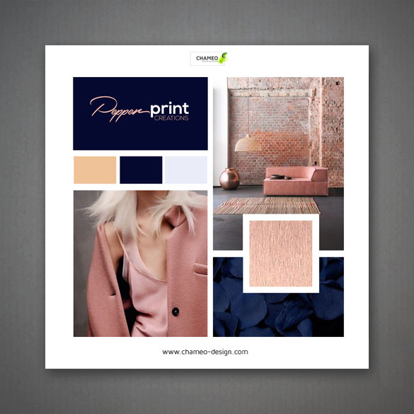
Some great news from our lovely client Pepperprint creations!
Begining of the year we started to work together with Pepperprint creations. Brainstorming their name, setting up mood boards, CI colors, fonts.....
From the very start we had a very good connection and really enjoyed the time working on this great design start up!
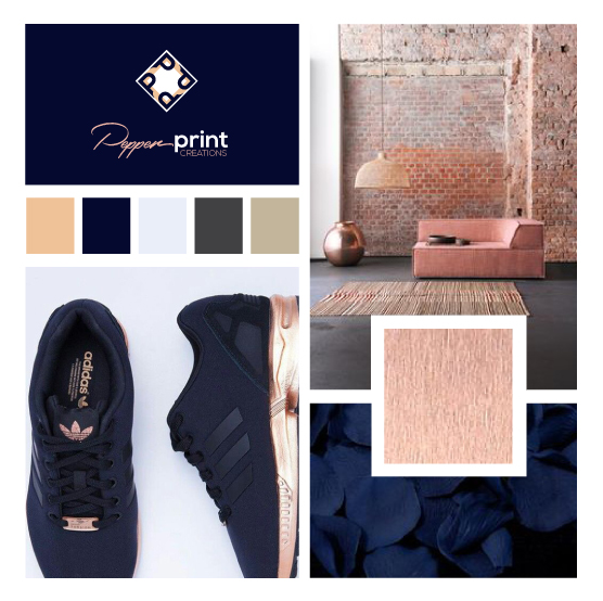

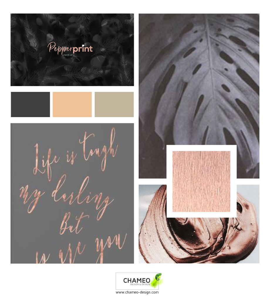
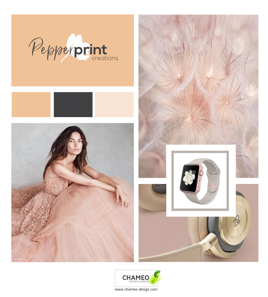


The result of our work was a branding both of us really were proud of!
Now a few month later, Chameo design loves to present you their Pepperprint creations first products which are amazing!
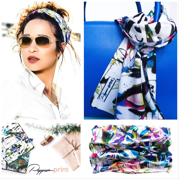
PEPPERPRINT® CREATIONS, a textile design studio based in Germany, has recently launched its first collection of striking loop scarves, made of high-quality material, with love and passion for detail.
Whether in everyday wear, at a spin in the convertible or motorbike, when travelling, or simply as a stylish accessory - with the vibrant designs and the multiple wearing options, the PEPPERPRINT loop scarves are absolutely eye-catching. But they do not only look good, but also feel amazing: They are made of 100% microfibre and certified in accordance with Oeko-Tex® STANDARD 100. The seamless and breathable material guarantees an excellent wearing comfort. Thanks to the antibacterial and fast dry properties it also is the ideal companion for all outdoor sports activities.
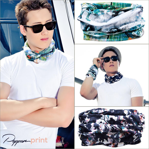
Each scarf will be delivered in it's own exclusive packaging, printed with the design of the loop. Thus the loops are also an ideal present for any occasion - the gift wrapping is included already.
The PEPPERPRINT® Studio is paying particular attention to eco-friendly manufacturing processes and a responsible handling of valuable resources. They are manufacturing exclusively in Germany, to guarantee an excellent quality, while being able to ensure fair and just working conditions throughout the entire manufacturing process - this particularly matters to them.
The endeavour of PEPPERPRINT® CREATIONS is to design beautiful and meaningful products, bringing that extra something into people’s lives and adding value to the world.
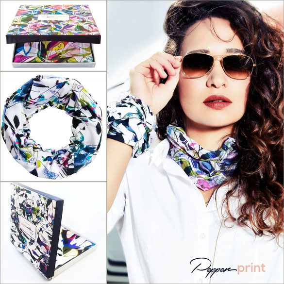
Find the products on pepperprintcreations.
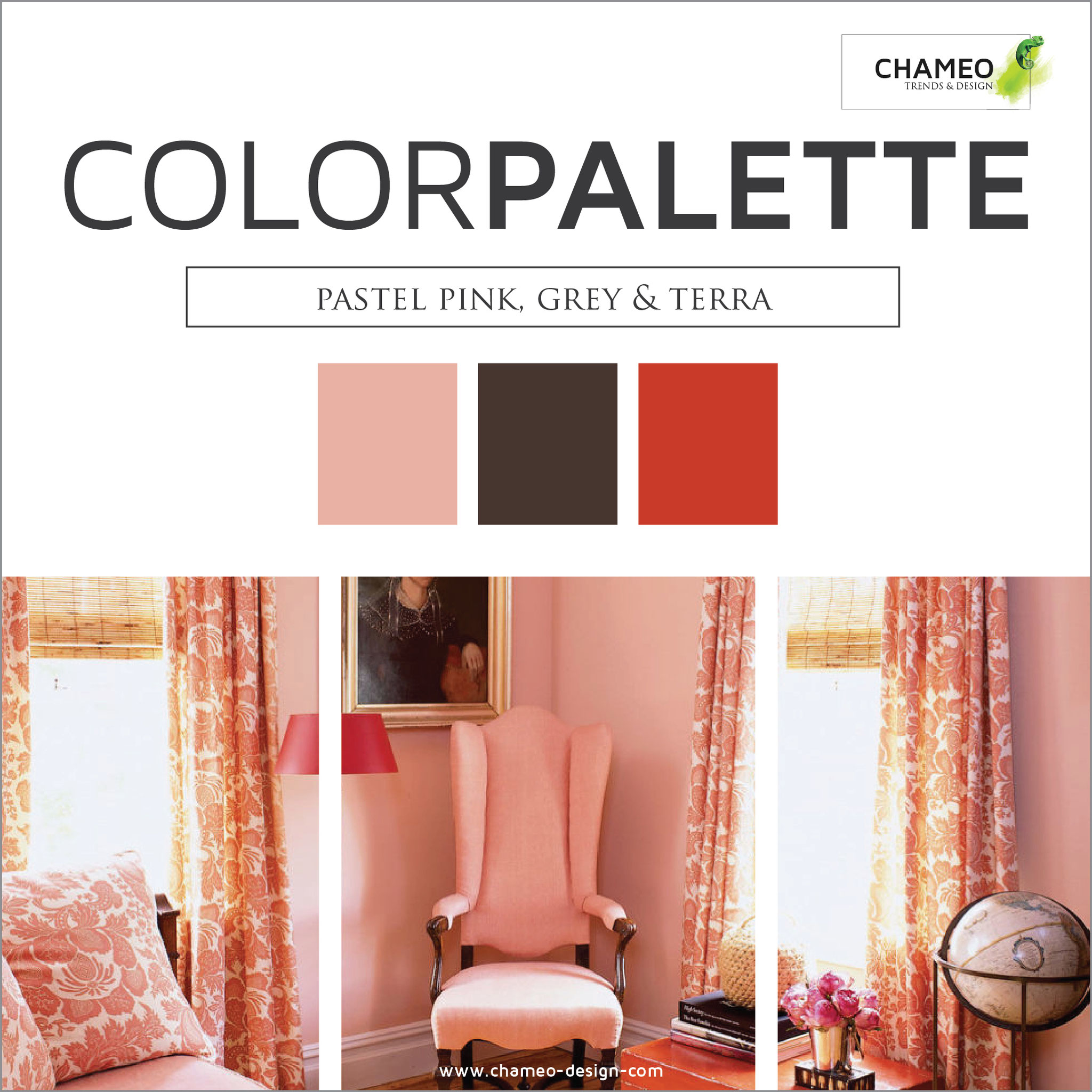
The psychology of colors in clothing
Did you know that 90 seconds is all it takes for a product to create an impression? As many as 85% of consumers believe that colour is the chief factor while buying a product.
This means that colours and the psychology of colour plays a huge role when it comes to choosing clothing to buy as well as choosing clothing to wear on a daily basis. Not only can emotions take control over of the colours we choose, but colours can also alter our emotions as well. The colours in clothing can have both an impact on your own emotions as well as the emotions of others.
Depending on the situation you’re in, as you could be dressing for work or leisure, you can choose certain colours in your clothing to reflect the mood you want to convey. For example, bright green is great for anyone in the creative industries as it reflects creative and refreshing emotions. Dark blue is good for conferences as it portrays authority and power and yellow is ideal for social gatherings where you want to reflect fun and energetic emotions. These are just some key examples of the power of colours in clothing.
The guys over at Positive Branding have designed a cool infographic below which pinpoints some of the key psychology behind colours in clothing, covering the different shades of blue, green, yellow, orange, red, black, white and grey and what they might mean. In an easy-to-follow layout, the infographic also pinpoints some of the favourite colours between men and women, as well as some of the least favourite colours.

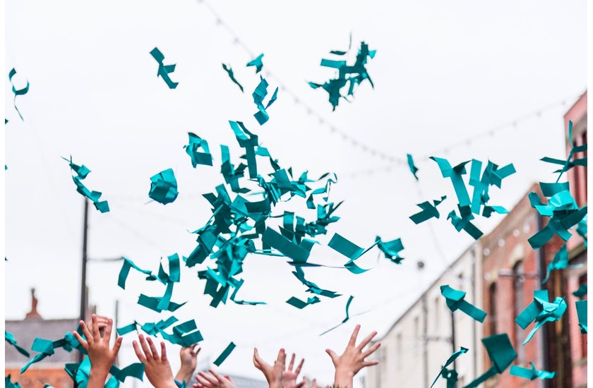
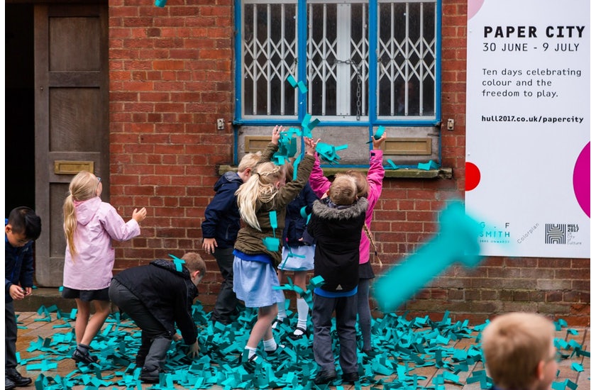
WHAT IS THE WORLDS FAVORITE COLOR?
Everybody has his own favorite color. It mirrors our personality and has influence on how we act and how other people perceive us. That is the reason why GF Smith started a challenge together with the design agency„Made Thought“ as well as Hull, the british capital of culture 2017.
IS IT A BLUE OR A GREEN?
Till 31st of March the participants were able to take part and win.
A few days ago the result of over 30000 votes was published.
The winner is „Marrs Green“,
a mixture of blue, green and red. It was announced by thousands of paper helicopters coming down the sky at Humber Street in Hull.


The winning color is added as 51st tone to GF Smith range of high quality paper Colorplan. The participant who came closest to the most mentioned color, has the honor to give the 51st Colorplan-tone his name.
Additionally the winner receives a personalized letter set and a vacation for 2 persons to
GF-Smith-paper company.Furthermore a Pop-up-Shopis opened where furniture, fashion and Tokyo Bikes, specially designed in the color„Marrs Green“, are sold.
ONE COLOR TREND AND MANY NAMES
Actually this isn't completly new to the most of us. The "green trend" was preticted by designer and trend researcher for quite some years.
Pantone announced her color of the year 2017 "Greenery" and it pops up in every corner of fashion, architecture, graphic design or interior design.
The only thing that is different with "Marss Green" is its naming!
Artists often speak of a cyan, webdesigners call it teal. In fashion stores would might ask for petrol.
On the streets people sometimes just call it turquoise.
No matter how they call it. We really like it and are pretty sure it will stick around for quite a while!
Here's how the most popular color of the world is produced.

Looking for simple and easy ways:
Persons who read this also liked this article:

Or downloaded our free branding checklist:

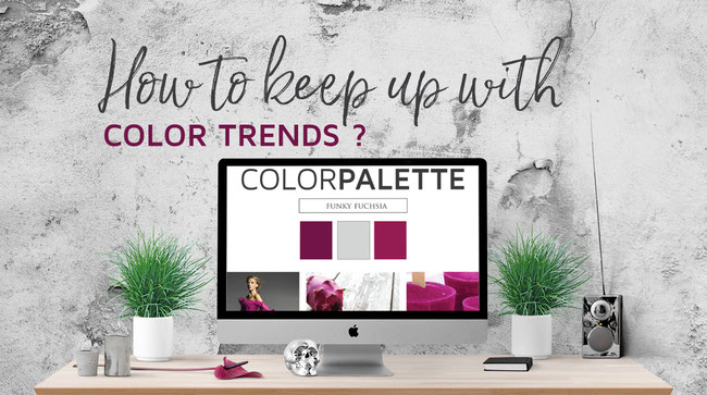
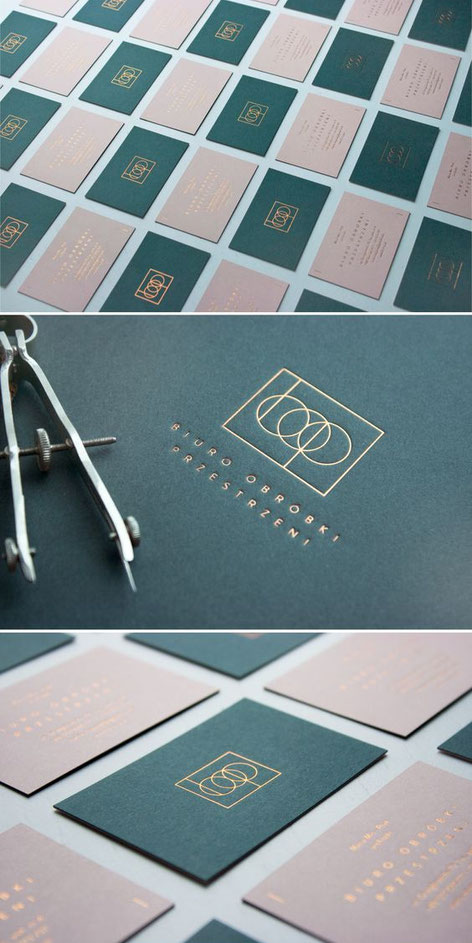
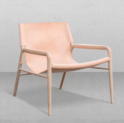
6 ways how "millennial PINK" gets the eyecatcher of the furniture show in Milano
pin this for later
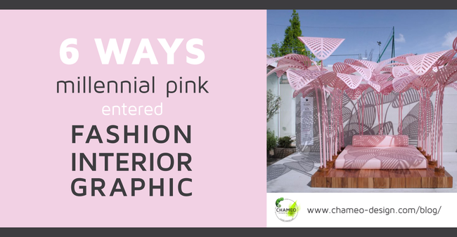
There is one color dominating all design disciplines like no other:"
"It is called millenial pink and can be described as a color developing out of beige, nude and a feminine light rose."1
It is incredibly popular in fashion and can't be overseen in graphic and branding design. The furniture show in Milano proved that Interior Design seams to be keen on it as well.
Millennial Pink was used by big named brands like Moroso, the scandinavian design company Muuto & Normann Copenhagen.
It even got on the top 10 list of the most instagramed topics of the Salone di mobile 2017.
With the hashtag #milanogram2017 all trends made their way around the world this year.
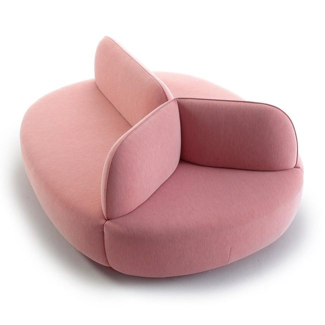
Isla by Note Design Studio for Sancal
Note Design Studio's biggest launch in Milan was this island sofa for Spanish brand Sancal shown at the Salone del Mobile in millennial pink. It is the latest in a series of pink products created by the Stockholm-based design studio.
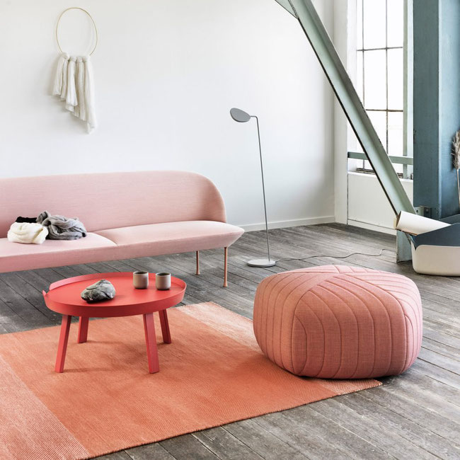
Five Pouff by Anderssen & Voll for Muuto
As mentioned above the brilliant Danish brand Muuto chose the pink to dominate their design! Highlights included the new Five Pouff by Norwegian studio Anderssen & Voll, a five-sided piece with stitched stripes.
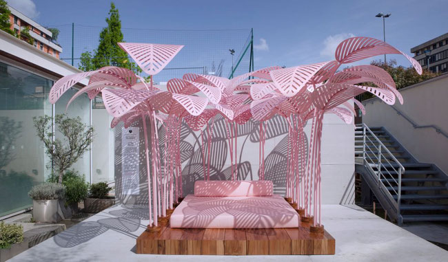
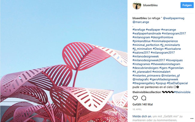
Le Refuge by Marc Ange
Created by Paris-based designer Marc Ange, this pink bed became the most Instagrammed installation at Milan design week. It is shaded beneath a canopy of pink leaf-shaped panels and picks up the palmation trends we are following for quite a while.

Looking for a list of 16 Graphic design trends? Just Visit Chameo Design's Trendresearch area!
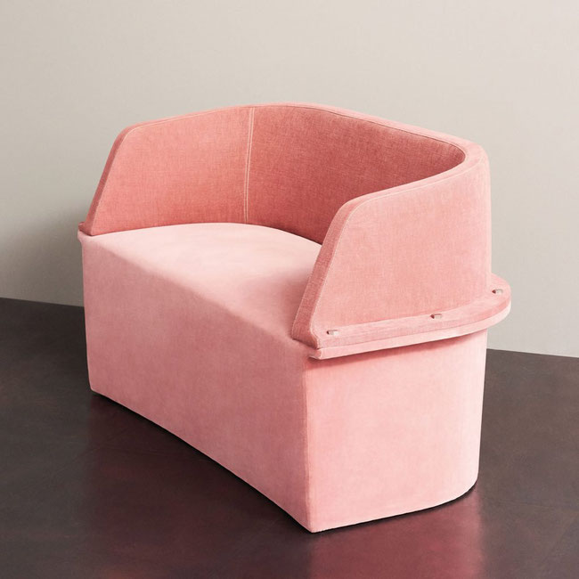
Assembly sofa by Diesel Living with Moroso
Italian brand Moroso teamed up with fashion brand Diesel to create what it calls a "collection of laid-back, comfortable products" in Milan. Among them was the Assembly sofa, which combines textured fabrics like plush velvet and felt with industrial steel bolts.
Gorgeous!
Now you might be asking yourself, which color can be used perfectly with Millenial Pink? Our answer is very clear: JADE GREEN!
As seen a lot in Branding design at the moment, this is an awesome example:
The interest in pink didn't come out of nothing. Media has been written about it for quite some time and not only fashion bloggers and journalists. Just to name a few big ones:
The Guardian, New York Magazine and Times.
By the time everyone started calling it Millennial Pink in the summer of 2016, the color had mutated and expanded to include a range of shades from beige with just a touch of blush to a peach-salmon hybrid.


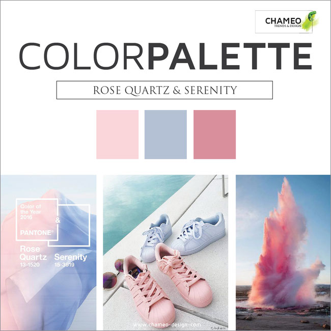
In the same year Pantone named the more warm color Rose Quartz Color of the year!
Rose Quartz, described as "a warmer embracing rose tone" and Serenity, which is a "cooler tranquil blue" were apparently chosen to reflect consumers seeking soothing colours.
You liked the article? That's great!
- Visit our Trendresearch for more.
- See our Services for supporting your company in Branding or the color & material Design of your products.
- Or just drop us a line to keep in touch!
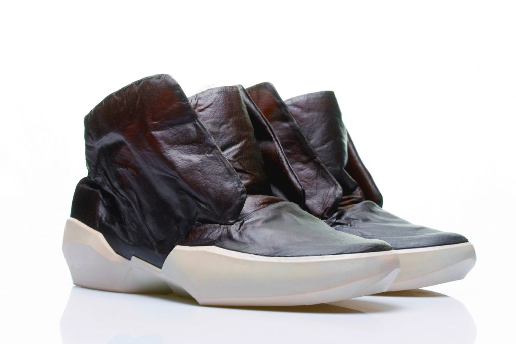
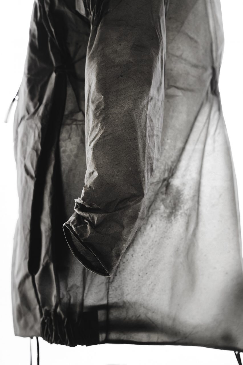
How the new innovative transparent leather enters the fashion industry!

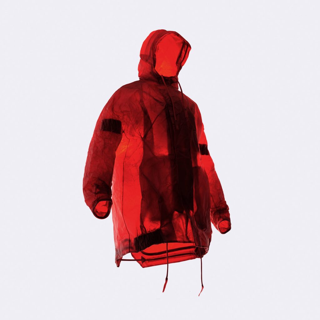


Fashion designer Sruli Recht used transparent cow skin leather to create the Apparition collection for Dutch company ECCO.
The collection is the result of a three-year project, during which Recht and a team from ECCO's Netherlands leather lab aimed to create the world's first transparent cow-hide leather.
Although transparent leather had previously been achieved with smaller hides, such as goat and sheep, it had been hard like parchment. Recht wanted to create a supple version that could be manipulated to create garments.
"It came out of the challenge of rethinking leather aesthetics in terms of both visual and touch properties," said Recht.
"We asked ourselves what would be the holy grail of leather? I would say it would be creating a futuristic material that still maintains the properties that we know, love, and require from leather."